About the blue book
The absolute first thing to be built in scriptbin history was the logo at the top left: a blue book emoji — 📘 — followed by "scriptbin" in the font Quicksand. This is also why "scriptbin" is spelled with a lowercase "s"; I just thought it looked better that way.
The emoji worked well but did look different on different platforms. In particular, that also made it hard to pin down a "favicon" (the icon shown in browser tabs and address bars) since I would have to choose a particular rendering. And when I had to boil down scriptbin to a logo or a banner, I had to do that too, with the potential risk of the creator of the emoji rendering deciding I should have to stop using theirs. (Not very likely, but not impossible either.)
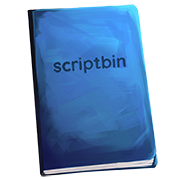
For all these reasons, I've long wanted to replace the blue emoji book with a better, custom book, just for scriptbin. Yesterday, after seeing interesting work by an artist with an art style that reminded me of what I had in mind, I wrapped up all my thoughts about a drawn blue book, looking a bit more like a writer's notebook than a hardcover print volume, and got in touch with the artist for a commission.
As you can see, the artist Fractal did a great job, and the book now proudly adorns the logo corner. There are details you can't make out at lower sizes, but as with great works of art, you don't have to see all of them to know what it is supposed to look like. And it is distinctive enough, including capturing the fun shading, even in the small, favicon size.
Since this is a large and clearly visible change to the visual imprint of the site, I wanted to write this post to explain what just happened. Many of the scripts here have a definite goal and a clear purpose, in a way that many scripts or pieces of writing of other kinds have. It's possible to look at that aspect and see something perfunctory, to imagine that there is no art or creativity to it but just the shortest path to the goal. Hopefully, many writers, performers and readers of the scripts see something different. In seeing thousands of scripts about similar subjects, they see the details, twists and turns, moods, characters and tone changes that makes ten scripts with ostensibly very similar events judging from afar (or going strictly by, say, a dominant tag) still distinct.
Instead of having "a" blue book — platform's choice — as its symbol, scriptbin now has its own blue book, and that feels neat. Emoji are used across the site to illustrate the user interface, but in the place that is meant to represent the site, I think it is fitting that it is a very special, less perfunctory, less interchangeable blue book, since details matter, details stick with you and details can make all the difference.
(Oh, and so can talent. This is an early sketch of mine and it's not likely the final product would have been much better. Thanks again to Fractal.)